Property managers brand it themselves now
- Company
- Updater
- Role
- Lead designer, built in code
- Surfaces
- UPO + Mover App
- Users
- Marketing teams, non-designers
- Year
- 2025
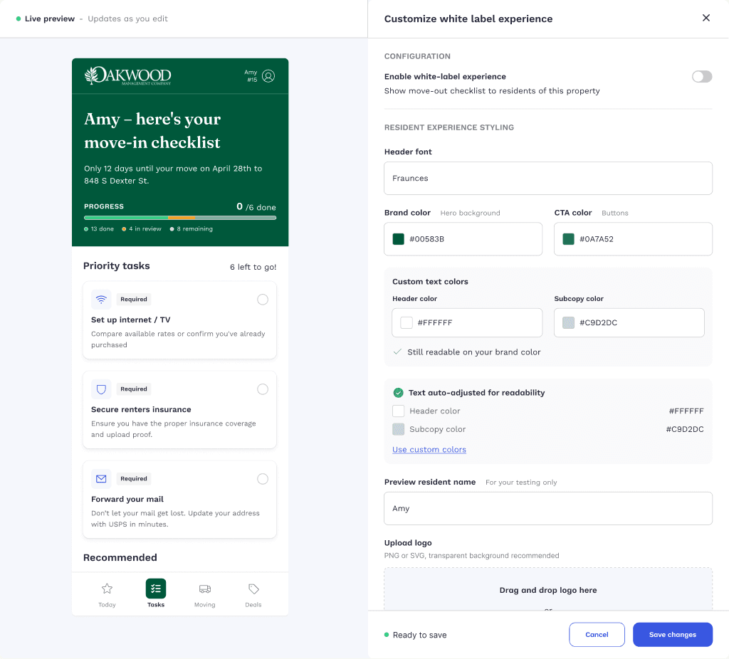
Every property configuration used to pull in three teams: design to check the branding, engineering to apply it, client support to field what came back. It did not scale, and accessibility was nobody’s job. A resident could land on a portal where the primary button was barely legible against its background.
Two decisions that shaped it
Warn in residents, not in ratios
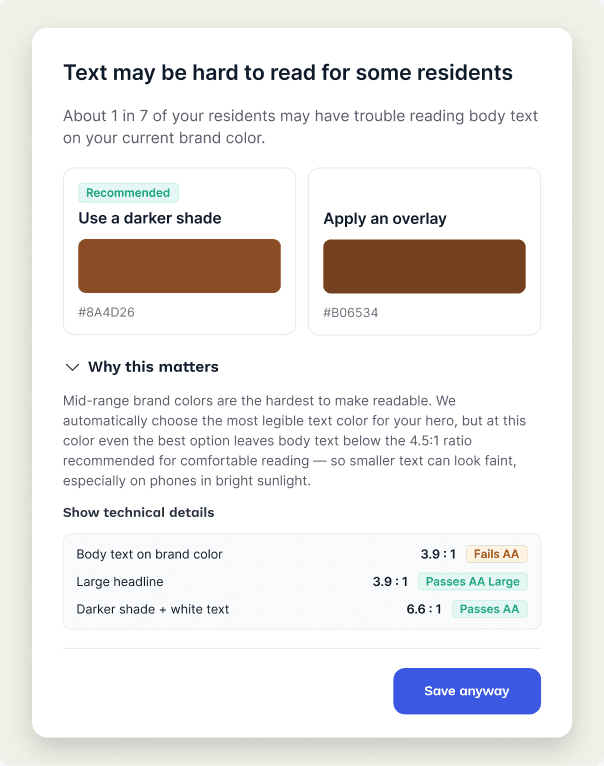
The system derives readable text over whatever brand colour is entered. When even the best option cannot reach AA, it stops at save and says what that means in plain terms: about 1 in 7 residents may struggle to read body text. Two fixes sit under it, recommended one first, with the contrast table one click away for anyone who wants it. Blocking a paying client’s brand colour would have started a negotiation. Saying nothing would have shipped the failure. This does neither.
Preview both surfaces before publish
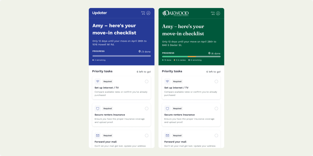
Branding lands on UPO, which staff use, and the Mover App, which residents use. Showing only one means approving a surface you never saw, and the resident-facing one is where the cost of getting it wrong actually lands.
Why accessibility was the business case
A brand colour that made the resident experience harder to use meant fewer residents completing setup. Fewer completions meant worse performance on a service the property manager had staked their name on, and lower revenue from the verticals Updater sells against it. Accessibility and revenue pointed the same direction, which is what let the system say no to a paying client’s input without it becoming a fight.
How I worked
Derived palettes
A full token set generated from one or two brand inputs.
Contrast test harness
Every derived pair checked against the surfaces it renders on.
Fallback rules
Written down, so the behaviour is predictable rather than a judgement call.
What I would change
Branding stops at colour, logo and header font. That is enough for a portal to feel like the property manager’s, but not enough for it to feel built for them. The next step is a wider set of templates and components, so a partner can shape layout and content structure rather than only the surface.