One design language for three products
- Company
- Updater
- Role
- Lead designer, built in code
- Scope
- 3 products + partner themes
- Users
- Internal product teams
- Year
- 2025
Three products had drifted apart. A consumer app, a property manager tool and a set of embedded partner buyflows, each with its own idea of what grey meant and how far a shadow should fall. The obvious fix was a new component library. The problem with that fix is that every team would have had to stop shipping to adopt it.
Two decisions that shaped it
A layer on top, not a rewrite
Polaris is a semantic token layer added over the component library that already existed, not a replacement for it. Every public import path stayed valid, so no team had to pause work to adopt it. Components migrate one at a time in small pull requests, and a product that has not migrated yet still builds and ships. A rewrite would have been cleaner on paper and would have taken a year nobody was willing to give it.
Name tokens for intent, not for value
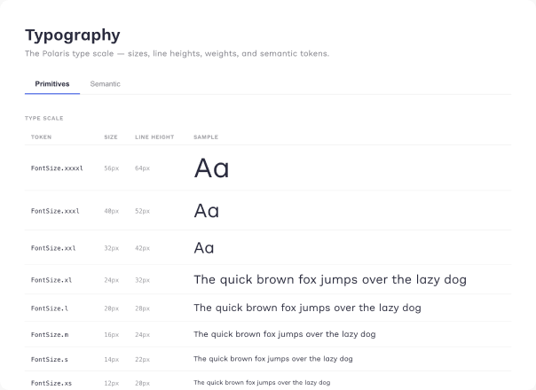
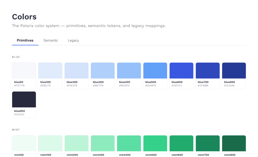
Tokens read as category, element, variant, state, so a component asks for text.color.secondary rather than gray700. Components never reference the palette directly. It is a small rule that decides whether a system holds: once a component names an intent instead of a colour, the value behind it can change per surface, per brand or per theme without touching the component at all.
A second checkbox, not a replaced one
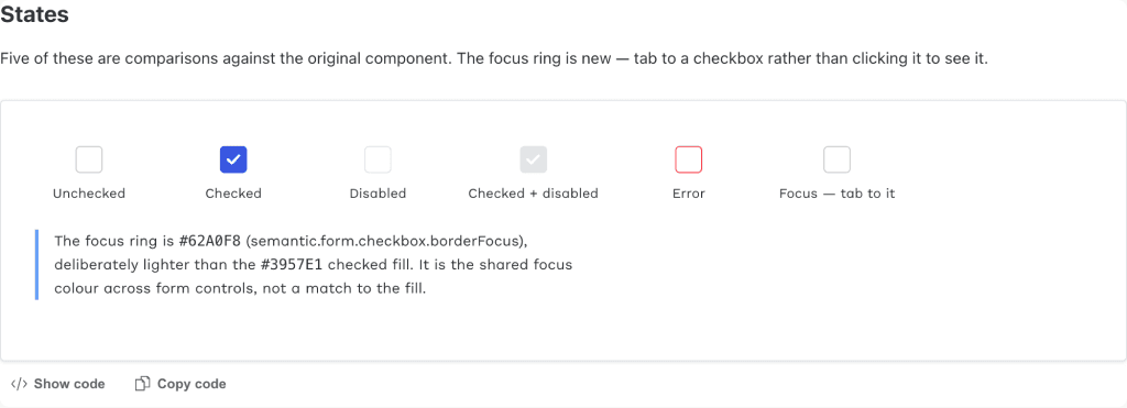
CheckboxV2 ships alongside the original, which is unchanged and still in use, and screens migrate to it one at a time. The original exposed three sizes and let the checked fill be green, blue or white, which is how it drifted across the app. The new one is always 24px, resolves every colour through a semantic token with no palette references or raw hex left in the component, and adds a focus ring the original never had. Radio followed the same pattern. The same argument as the token layer, one level down.
How I worked
Storybook as the contract
Every foundation documented with Primitives, Semantic and Legacy side by side, so the migration state is visible rather than tribal knowledge.
Small, reviewable PRs
One foundation per pull request, each with what changed, why, and what to check.
Decision log
Collisions and deferrals written down as they came up, including the ones left unresolved.
What I would change
Radius is unfinished. The scale Polaris wanted collides with a legacy key of the same name at a different value, so rather than silently change every rounded corner in production I shipped the primitives and left the semantic layer out until the intent is settled. The Figma tokens have also drifted behind the code. A system that documents itself in two places will always drift, and the honest fix is generating one from the other.