From four clicks to two taps
- Company
- Emma Divines
- Role
- Freelance, design through launch
- Scope
- Website, WordPress plugin, illustration system
- Users
- People booking a psychic reading
- Year
- 2026
Emma Divines is a psychic, medium and Reiki teacher in Sacramento. Her complaint about her own site was specific: it took too much navigation to reach her offerings. Booking meant home, category page, scroll, Schedule Here, then Calendly. No price appeared anywhere on the site, so visitors found out what a reading cost at the last step. It had to stay on WordPress so she could keep editing it herself, and she wanted it to feel, in her words, mysterious, vibey and feminine.
Two decisions that shaped it
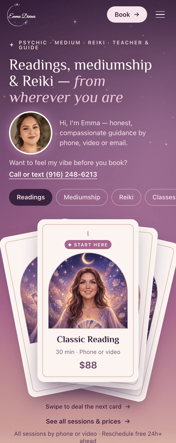
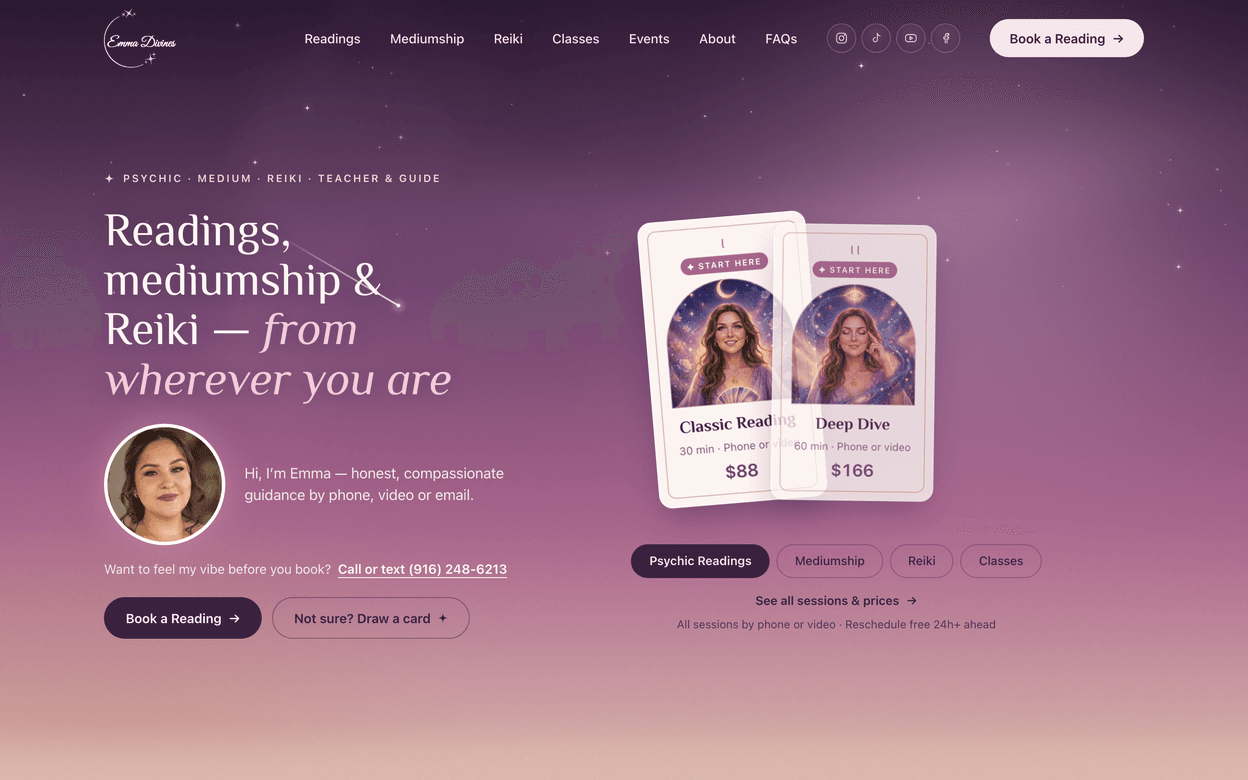
The offerings are the homepage
Ten Elementor pages became one homepage where every session is a tarot card above the fold, with its price on the face and Book on the back. Each card links straight to that session’s Calendly event, so a visitor can book in two taps. Categories open as sheets instead of pages, and every old URL redirects to the matching sheet, so search rankings and old links still work. The prices were not on the site at all, so I pulled them from Calendly’s public booking data rather than ask Emma to retype them.
Engagement that ends in a booking
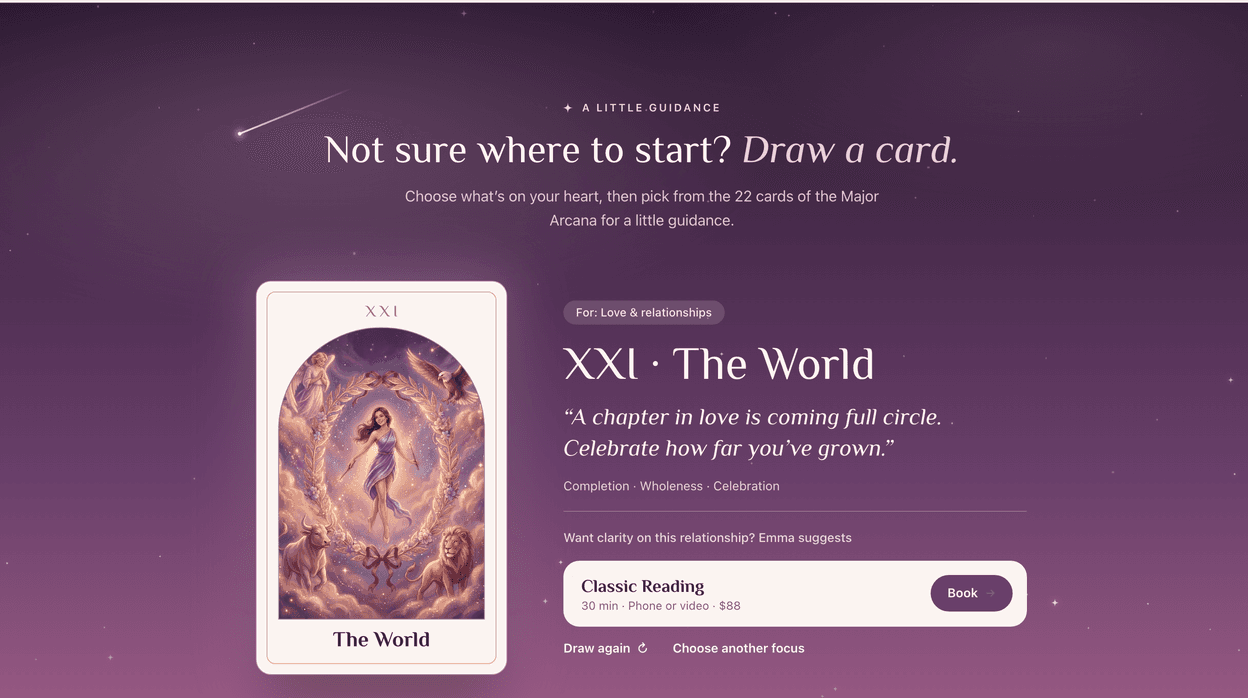
Emma asked for a one-card pull from her deck. I designed three versions and picked the one that ends at a booking: choose what is on your heart, shuffle, pick one of the 22 Major Arcana, and the card gives a short reading for that focus and suggests the session that fits it. Love points to a Classic Reading, a loved one who has passed points to Mediumship. It is the most playful part of the site, and every path through it ends at a Book button.
What changed
The site went from audit to live in about a week. It is a custom WordPress plugin rather than a page-builder layout. Emma edits sessions, prices, reviews, FAQs and all 22 tarot readings from dashboard screens built for that content, and the page renders the coded prototype pixel for pixel. Launch meant six patch releases against the host’s caching and script-combining, which broke the page in ways no local test reproduced. Analytics track every step from category to card to booking, and data only started on launch day, so there are no conversion numbers here yet.
How I worked
Three directions, compared live
Wireframes, then three hi-fi directions in Figma and a live explorer so Emma could switch between them on her own phone. She chose the second, and her Figma comments went into a second review round.
An art-directed illustration system
Seventeen session cards in her likeness and all 22 Major Arcana, generated with AI and directed by me. The rules that held them together were written down: match her face but not the pose, crop from mid-chest up, and keep to the brand palette.
A style guide she did not have
Her brand guide was a thin PDF. The new one is in Figma, with colour variables, text styles and components, including a real review card.
What I would change
I made the hero photo smaller to get the cards higher, and Emma asked for it bigger. She was right. The site sells her as much as the sessions, and a smaller face read as distant. I would test that with the client before cutting it, not after. I would also have set up analytics before launch rather than with it, so there would be a baseline to compare against.